Types Of Red
Red is a primary color that is associated with heat, passion, and love. It is a bold and attention-grabbing color that can be used in a variety of ways to create a powerful impact. There are many different types of red, each with its own unique shade and hue.
Understanding red and its various shades is important for anyone interested in design, art, or fashion. Different shades of red can evoke different emotions and have different cultural significances. For example, deep, dark reds may be associated with luxury and sophistication, while brighter, more vibrant shades of red may be associated with energy and excitement.
Key Takeaways:
- Red is a primary color associated with heat, passion, and love.
- There are many different types of red, each with its own unique shade and hue.
- Understanding the emotional and cultural significance of different shades of red is important for anyone interested in design, art, or fashion.
Understanding Red
Color Theory Basics
Red is a primary color in the RGB (Red, Green, Blue) color model, which is widely used in digital media. It has a hue angle of 0 degrees, which means it is located at the longest wavelength end of the visible spectrum. The hex code for pure red is #FF0000, and the RGB values are 255, 0, 0.
In color theory, red is often associated with passion, love, and intensity. It can evoke strong emotions and is often used to grab attention in design. When combined with other colors, red can create a range of different moods and feelings.
Red in Design
Red is a popular color in design due to its striking and attention-grabbing nature. It is often used to create a sense of urgency or importance, making it a common choice for warning signs and calls to action.
Different shades of red can convey different emotions and meanings. For example, darker shades of red such as burgundy and maroon can represent sophistication and elegance, while brighter shades like scarlet and crimson can represent passion and excitement.
When using red in design, it’s important to consider the tone and shade of the color, as well as how it will interact with other colors in the design. Using red in combination with complementary colors like green or blue can create a strong visual contrast, while using analogous colors like orange or pink can create a more harmonious and balanced design.
Overall, understanding the different shades and meanings of red can help designers make informed decisions when using this powerful color in their work.
Shades of Red
Red is a color that is widely used in branding, fashion, and art. There are many shades of red, ranging from warm to cool, light to dark, and everything in between. In this section, we will explore some of the most popular shades of red, including scarlet, crimson, ruby, bright red, dark red, light red, pink, orange, blood red, carmine, and amaranth.
Warm and Cool Reds
Warm reds are those that have a yellow or orange undertone, while cool reds have a blue or purple undertone. Scarlet is a warm red that is bright and bold, while crimson is a cooler, deeper red that is often associated with passion and romance. Ruby is a warm red that has a pinkish hue, while bright red is a true primary color that is often used in branding and advertising. Dark red is a cooler, deeper shade of red that is often used in fashion and home decor, while light red is a softer, more delicate shade that is often used in floral arrangements and feminine branding.
Dark and Light Reds
In addition to warm and cool reds, there are also dark and light reds. Blood red is a dark, rich shade of red that is often associated with danger and warning signs. Carmine is another dark red that has a purple undertone and is often used in cosmetics and textiles. Amaranth is a lighter shade of red that has a pinkish hue and is often used in floral arrangements and home decor.
Overall, there are many different shades of red to choose from, each with its own unique characteristics and associations. Whether you are looking for a bold, bright red or a soft, delicate shade, there is sure to be a shade of red that is perfect for your needs.
Cultural and Emotional Significance
Red in Culture
Red is a color that holds significant cultural importance in many societies around the world. In Chinese culture, red is associated with luck, good fortune, and prosperity. It is often used during festive occasions such as weddings and the Lunar New Year. In Hinduism, red is associated with purity, sensuality, and the goddess of power and destruction, Kali. In Western culture, red is often associated with passion, love, and romance. It is also used as the color of warning and danger, such as in traffic lights and stop signs.
Red and Emotion
Red is a color that is often associated with strong emotions. It is known to evoke feelings of passion, love, joy, energy, and desire. It is also associated with heat and intensity, which can make it a symbol of danger and aggression in some contexts. In terms of physical sensations, red is often associated with warmth and arousal.
In terms of gender, red is often associated with women, particularly in fashion and beauty industries. It is seen as a vibrant and attractive color that can evoke feelings of femininity and sensuality.
In conclusion, the cultural and emotional significance of the color red is vast and varied. It holds different meanings and associations in different cultures and contexts. However, one thing is clear: red is a color that evokes strong emotions and can have a powerful impact on our perceptions and experiences.
Red in Nature and Industry
Red in the Natural World
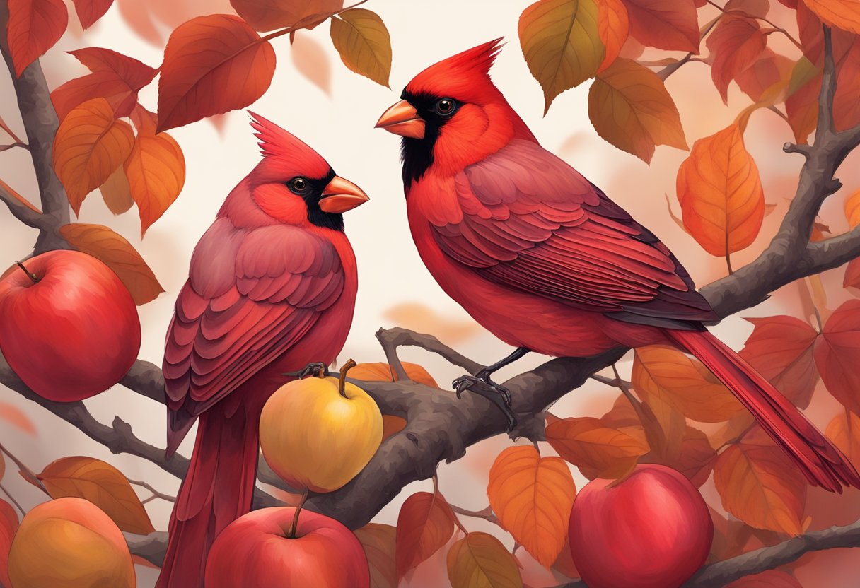
Red is a color that is commonly found in nature, particularly in flowers, fruits, and minerals. One of the most well-known red fruits is the tomato, which is widely used in cooking and is known for its bright red color. Another fruit that is commonly associated with the color red is the cherry, which is often used as a decorative element in desserts. Rust is a reddish-brown color that is created when iron is exposed to moisture and oxygen, and it is commonly found on metal surfaces that have been exposed to the elements.
Fire is another natural phenomenon that is often associated with the color red. Flames are typically orange or yellow, but they can also have a reddish hue depending on the temperature of the fire. Brick is a material that is commonly used in construction and is known for its reddish-brown color. Coral is a type of marine animal that is often found in tropical waters, and it is known for its bright red color.
Red in Commercial Use
The color red is also widely used in commercial applications, particularly in the manufacturing of pigments and paints. Red pigments are used in a variety of products, including cosmetics, plastics, and textiles. In the art world, red is a popular color for paintings, particularly in the works of artists such as Vincent van Gogh and Pablo Picasso.
In the automotive industry, red is a popular color for sports cars and other high-performance vehicles. Red is also commonly used in advertising and branding, particularly for companies that want to convey a sense of energy and excitement. Overall, the color red has a wide range of applications in both the natural world and in commercial use, making it a versatile and popular color choice.
Color Combinations and Contrasts
Complementary Colors
Red is a bold and intense color that can be paired with a variety of other colors to create striking color combinations. One of the most popular combinations is with green, which is its complementary color. This pairing creates a high contrast and vibrant look, making elements stand out. However, it is important to use these colors in moderation as they can be overwhelming when used in large quantities.
Another complementary color to red is blue. This combination creates a more calming effect, making it a popular choice for branding and design. Yellow and purple are also complementary colors to red, but they are less commonly used in combination.
Analogous and Triadic Schemes
Analogous color schemes are created by using colors that are adjacent to each other on the color wheel. For red, this includes colors such as orange and magenta. This combination creates a harmonious and cohesive look, making it a popular choice for branding and design.
Triadic color schemes are created by using three colors that are evenly spaced on the color wheel. For red, this includes colors such as green and blue. This combination creates a balanced and dynamic look, making it a popular choice for graphic design.
When using color combinations, it is important to consider contrast. Pairing red with white or black creates a high contrast and striking look, while pairing it with brown or beige creates a more subdued look.
In conclusion, there are a variety of color combinations and contrasts that can be used with red. Whether it’s complementary colors like green and blue, or analogous and triadic schemes like orange and magenta, the possibilities are endless. By considering contrast and balance, designers can create unique and impactful designs that stand out.